Improving science access through infographics
|
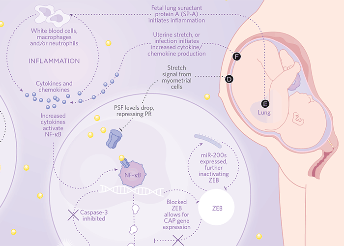
At last count, around two million new scholarly journal articles are published every year. Two million. That’s six times the number of new book titles published in the United States every year, one new journal article every eight seconds, and 100 times the number of Starbucks stores around the world. Two million is a lot. Impressive as this may seem, the reality is that while all this wonderful knowledge and research is “available,” it is not all “accessible.” Paywall issues aside—which is a rather significant aside—this abundance of literature represents an impossible mountain of reading. No one person can keep up with the 4,000 papers a day published by Elsevier alone, let alone read all the literature available from other publishing houses. Furthermore, not all articles are translated, which means that without investing lots of time, funding and effort, a language barrier limits the sharing of ideas between many scholars. Even sharing articles between scholars with a mutual language can be problematic: Certain disciplines have an esoteric jargon all of their own which scholars in other fields can find hard to decipher. So what happens is this: Scholars stick to reading papers that are available in their language and relate to their field of research. Some might argue that this makes practical sense. And with the launch of companies such as Faculty of 1000, scholars can now pinpoint the top recommended articles in their field instead of wading through the thousands upon thousands of papers that are not deemed quite as groundbreaking. But this approach, while practical, can be problematic. I recently listened to a fascinating TED talk by Dr. Deborah Rhodes, an expert at managing breast-cancer risk, who presented her invention of a new life saving tool for breast tumor detection. During the course of her research Dr. Rhodes just happened to be introduced to a nuclear physicist, Michael O’Connor, who is a specialist in cardiac imaging—something Dr. Rhodes would not normally have anything to do with. O’Connor just happened to tell Rhodes about a conference he had recently attended that had announced a new type of gamma detector. The gamma detector was unusual because it was smaller than a credit card (i.e., far smaller than any other gamma detector available). Gamma detectors were of interest to Dr. Rhodes because gamma rays can successfully penetrate dense breast tissue, but all gamma detectors that Dr. Rhodes knew of were large, bulky machines that would not be able to navigate the small areas of the breast. A tiny detector like the one Dr. O’Connor was describing was very exciting. After some research together involving a handful of the new detectors, some tape and an old mammography machine, Rhodes and O’Connor were able to create a prototype for a new machine called Molecular Breast Imagine (MBI) that was able to capture clear images of small tumors in dense breast tissue, something that had never before been possible. Interestingly, Dr Rhodes called her collaboration with Dr. O’Connor a “serendipitous collision,” which led me to consider if there might be a way to pave a less serendipitous path between an internist and a nuclear physicist. Could we address one facet of the “accessibility” problem by presenting research findings in a way that would encourage the sharing of ideas across disciplines …and while we are at it, also tackle the other facets: time limitations and language/jargon barriers? Possibly. As designer David McCandless so eloquently expressed in his TED Talk, ‘The beauty of data visualization”: “It feels like we’re all suffering from information overload or data glut. And the good news is there might be an easy solution to that, and that’s using our eyes more. So, visualizing information, so that we can see the patterns and connections that matter and then designing that information so it makes more sense, or it tells a story, or allows us to focus only on the information that’s important.” Recent studies have shown that 90% of the information transmitted to the brain is visual, and visuals are processed 60,000 times faster in the brain when compared to text. Forty percent of people will respond better to visual information than plain text, and visual content is proven to drive engagement. We live in an ever-increasingly visual world where digital images are shared at amazing rates. With 7 billion global internet users, 1.1 billion Facebook profiles, 500 million tweeters, and 49 million enjoying Pinterest, it is possible for a single image to span the world and reach people from all walks of life who speak immeasurable languages…in seconds. In his talk, McCandless emphasized that every day we are being bombarded with information design that is “poured into our eyes through the web.” Consequently we are all “visualizers” and are “demanding a visual aspect to our information.” Now of course, social media might not be the ideal platform for sharing academic research, but the idea is there: Imagery, diagrams, illustrations and infographics could offer researchers a way to efficiently deliver information to a diverse audience. In addition to simplifying distribution and addressing time and language constraints, there are other important benefits to illustrating research. Imagine if an architect submitted her plans solely using words instead of an illustrated blueprint. Would it be possible to accurately communicate the vision to the crew using only words? Would it be possible to pinpoint errors in the design before the building began without viewing a sketch? Would a written plan, presented to two contractors, be interpreted in the exact same way and result in the same final product? We might all agree that it would be ludicrous not to utilize a blueprint when attempting to communicate something as complicated as a house. And yet we will accept a text-only manuscript that communicates complex research. Something seems lacking here. I can tell you that from my experience as a graphic designer and science illustrator that, more often than not, when I am sketching a complicated diagram using text as my reference, I discover that I am missing information. For example, if I am illustrating a new protein pathway, I need to understand where to situate the protein in a physical space. Does the protein exist on the membrane? In the nucleus? In the cytoplasm? The correct location might be common knowledge to the author who has spent years of his life working on related research and takes for granted that this fact it is not so obvious to readers of the author’s article. Similarly, the article might explain how a molecule travels between point A to B in the cell, and how it loops around from point C to D, but it is only when I start to sketch that it becomesvisually clear that we do not know how this molecule jumps from point B to C: There is a gap in the information that my editors had not been able to recognize because it was buried within the words of the article. Interestingly, this gap is sometimes easily plugged by a quick chat with the author. Other times the author will explain that the gap represents something that just isn’t known yet. Ah ha! I say, let’s note that clearly…maybe someone else out there does know! On occasion, I have even been able to cross-reference my own work. I’ll start sketching a cellular pathway and realize that I’ve have drawn something slightly similar in the past. I can also visualize where other pathways might fit in and can see interesting patterns, helpful repetition, or informative links that would have not otherwise registered. It might be argued that my point is moot; the inclusion of graphics is already the status quo for publishing articles. It’s true. Many articles do include figures, charts, micrographs and other imagery. However, these figures are often are very hard to interpret. Through my work as a graphic designer, I have looked at hundreds of figures and charts and have found that, more often than not, their message is not instantly clear. The figures might make perfect sense to the authors and their respective editors when they were published, but as a reader I have to work hard to pick out the trends and piece together the key information. The issue here is that researchers (at least for the most part) are not experts in infographic design, and their graphics can be overly-complicated, cluttered and …downright offputting. Instead of hiring an experienced visual thinker, authors often create the graphics themselves. Publishing houses will then spend a short while standardizing the colors and fonts, but commonly do not delve too far into questioning the graphic’s content. Not hiring a graphic designer from the get-go is undoubtedly cheaper, but in the long run, authors are potentially selling their research short. An infographic designer would be able to identify key information and discard clutter, present the complex information in a pleasing way, walk the reader through unfamiliar information and put themselves in readers’ shoes to a degree that would most likely be impossible for the author(s). Both Elsevier and Springer are catching onto the value of visuals by offering searchable image collections to their subscribers: Springer acknowledges that “Scientific research has become progressively more focused on raw data and visual forms of learning and communication” and has recently launched www.SpringerImages.com, a searchable database of over 1.5 million scientific images that span the scientific, technical and medical fields, including high-quality clinical images. Similarly, in late 2010, Elsevier announced the addition of a new image search feature to their www.sciencedirect.com database, allowing researchers to search more than 15 million images contained within their collection. However, the images in these collections—histograms, micrographs, graphs, bar charts and tables—are a far cry from the appetizing, step-by-step, sharable, crafted infographics that I am proposing. Most of the images in the collections do not make sense when viewed out of context of their articles, and apart from a few well-buried examples, are highly unlikey to be shared across disciplines, or prompt a productive discussion. Imagine instead a scenario in which infographic designers work closely with author(s) to create a beautiful, digestible primer-style info graphic to accompany each article, serving as an alternative to a written abstract, allowing an entry into the subject and aiding understanding. Imagine that we adopt a standardized style for infographics, similar to the standardized format for articles, so that the learning curve to “read” the graphics would become less steep. Furthermore, imagine if the SpringerImages and the Sciencedirect Image Search results were populated with these high-quality graphics, organized by topic, keyword and date published. Obviously it would be impossible to tell the whole story of an article in just one—be it excellent—infographic, but it would certainly be a reasonable expectation that it would tell enough of the story to whet readers’ appetites and motivate researchers to find out more. And it may even prompt a (less) serendipitous solution to a pressing question.
This blog was originally published here, on July 22, 2013, for The National Science Communication Institute, a 501c3 tax-exempt nonprofit charity. The mission is to help improve science collaboration, discovery, education and public policy by reforming the communication culture inside science.
|









One Comment